
The choice of a chromatic duo for a bedroom relies on often underestimated parameters: the color temperature of light sources, the light reflectance value (LRV) of each shade, and, recently, the impact of wavelengths on nighttime visual comfort. Here, we discuss the technical criteria that distinguish a successful combination of two colors from a flat or visually tiring result.
Filtering shades and blue light: a selection criterion for the bedroom
People exposed to screens in the evening are subjected to a spectrum rich in blue light (wavelengths between 380 and 500 nm). The walls of the bedroom contribute to reflecting this light. Warm-toned shades, particularly ochres, terracottas, and deep beiges, absorb more of the blue spectrum than cool grays or pure whites.
Recommended read : Local Tips for Parking at Rapp Parking in Colmar
We recommend favoring an LRV below 60 on the main wall to limit blue reverberation. An accent wall in terracotta paired with a warm beige on the other three walls creates a coherent passive filter. This type of duo reduces visual stimulation without excessively darkening the room.
To go further in implementation, understanding how to combine two paint colors in a bedroom also allows for mastering the application technique (cutting in, layering order, drying between shades).
Related reading : The best natural destinations in France for a complete immersion
Ophthalmologists examining the light hygiene of the bedroom agree on one point: avoid cool whites (bluish shades) on the ceiling when the artificial lighting is LED. A warm off-white leaning towards pale yellow better neutralizes the residual spectrum from screens.
Light reflectance value and color duo in adult bedrooms
The LRV, expressed on a scale from 0 (absolute black) to 100 (perfect white), determines the amount of visible light reflected by a painted surface. Most decor guides overlook this indicator. However, it conditions the visual balance between two shades.
Recommended LRV gap between the two colors
An LRV gap between 20 and 40 points between the accent wall and the secondary walls produces a readable contrast without a harsh effect. Below a 15-point gap, the two colors blend under artificial lighting. Beyond 50, the contrast strains the eye and visually fragments the space.
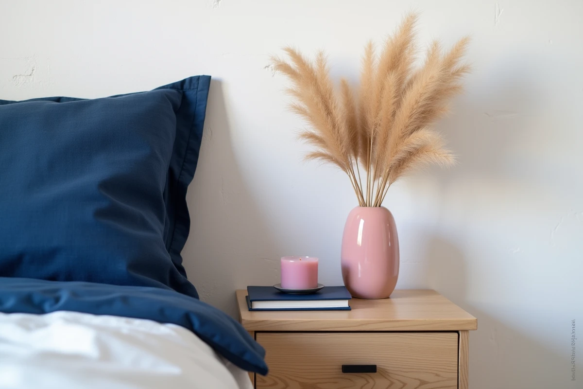
A concrete example: a midnight blue with an LRV around 8 paired with a light beige (LRV around 65) results in a gap close to 57, often too stark for a modestly sized bedroom. By replacing the light beige with a deep sand (LRV around 45), the gap drops to 37, and the ambiance gains in coherence.
Check the LRV before purchasing
Paint manufacturers display the LRV on their technical sheets, rarely on the color swatch in stores. We advise requesting the product sheet or checking the manufacturer’s website. Comparing the LRVs of the two chosen shades takes two minutes and avoids costly mistakes.
Zero VOC paints and matte combinations for the bedroom
European regulations have evolved with Directive (EU) 2025/2784 on volatile organic compound emissions, published in December 2025 in the Official Journal of the EU. Since January 2026, paints intended for bedrooms must comply with much stricter zero VOC thresholds than before.
This constraint steers the choice towards ranges formulated with plant-based or mineral resins. Matte and velvety finishes dominate these ranges, which directly influences the rendering of two-color combinations: a matte finish uniformly absorbs light and reduces surface imperfections, while a satin finish catches reflections and can create an imbalance between two shades placed side by side.
- Matte finish on both walls: uniform rendering, soft contrast, ideal for tone-on-tone duos (blue-gray and pearl gray, for example).
- Matte finish on the accent wall, velvet on the secondary walls: slight texture difference that enhances distinction without resorting to strong chromatic contrast.
- Satin finish only on the accent wall: to be reserved for well-lit bedrooms, as satin amplifies color perception and can destabilize a subtle duo.
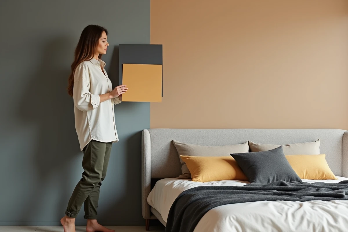
Terracotta-pastel blue duo versus gray-navy blue: field feedback
The combination of gray and navy blue remains a classic for adult bedrooms. It works in bright rooms facing south or west. However, in north-facing or poorly lit bedrooms, this duo accentuates the feeling of coldness and confinement.
According to observations reported by Maison & Travaux (Winter 2025-2026 special issue), the terracotta-pastel blue duo outperforms the gray-navy blue in perceived heat retention during the cold months. Terracotta, a pigment with a red-orange dominance, stimulates a higher thermal perception than gray, regardless of the actual temperature of the room.
The field study by the French Association of Interior Design (AFDI Field Insights 2026) also notes a significant decrease in complaints related to the darkening of bedrooms when a dark blue-beige duo is combined with warm white LED lighting. The choice of light source is an integral part of the chromatic project.
- North-facing room: prefer terracotta (headboard wall) and warm off-white.
- South-facing room with a large window: the navy blue-sand beige duo remains relevant, provided to choose a beige with an LRV above 50.
- Attic room with sloped ceiling: paint the slope in the lightest shade to avoid visually crushing the volume.
The choice of a color duo in a bedroom is not just a matter of taste. The orientation of the room, the type of finish allowed by VOC regulations, the LRV gap between the two shades, and the nature of the artificial lighting form a set of measurable constraints. Addressing these parameters in advance avoids repainting and ensures a lasting result, even under screen light at the end of the day.